Viator Rebrand
For the two years that I worked on the Viator brand, they underwent both a brand modernization (2019) and a full rebrand (spring 2020). For the latter project, an external agency was engaged for the first portion of the project. Once the first round of creative was established, I was brought in to create a full set of brand standards as well as documentation for the dev teams.
THE TEAM
Brand Director: Michael Lattig
Creative Directors: Jessica Erickson, Tom Loughlin
UX Design: Ilona Moreland
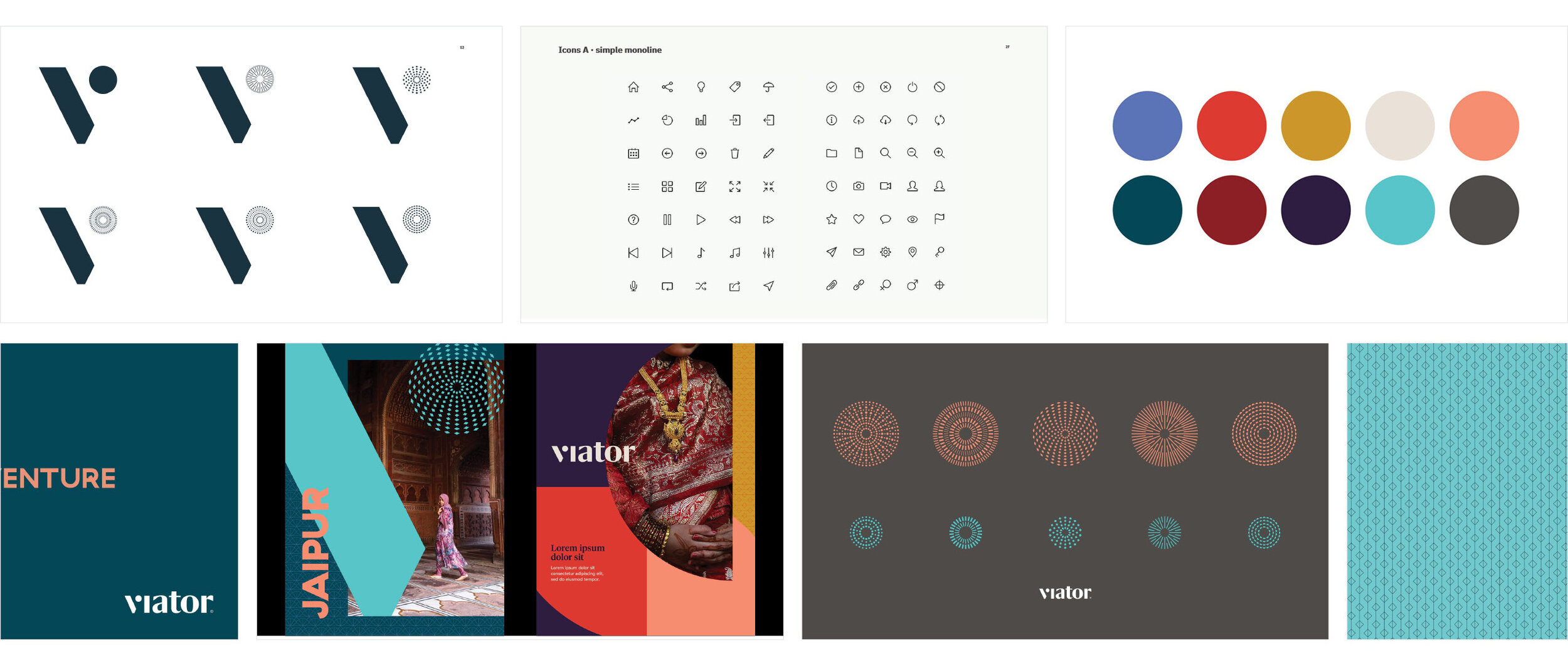
UI COLOR PALETTE EVOLUTION
The agency we worked with provided us with a preliminary color palette. During the process of applying it to the UI, we realized that it wasn’t complete. Some colors that were meant to be used for type were not accessibility compliant. In addition, our UI required additions to our grey palette.


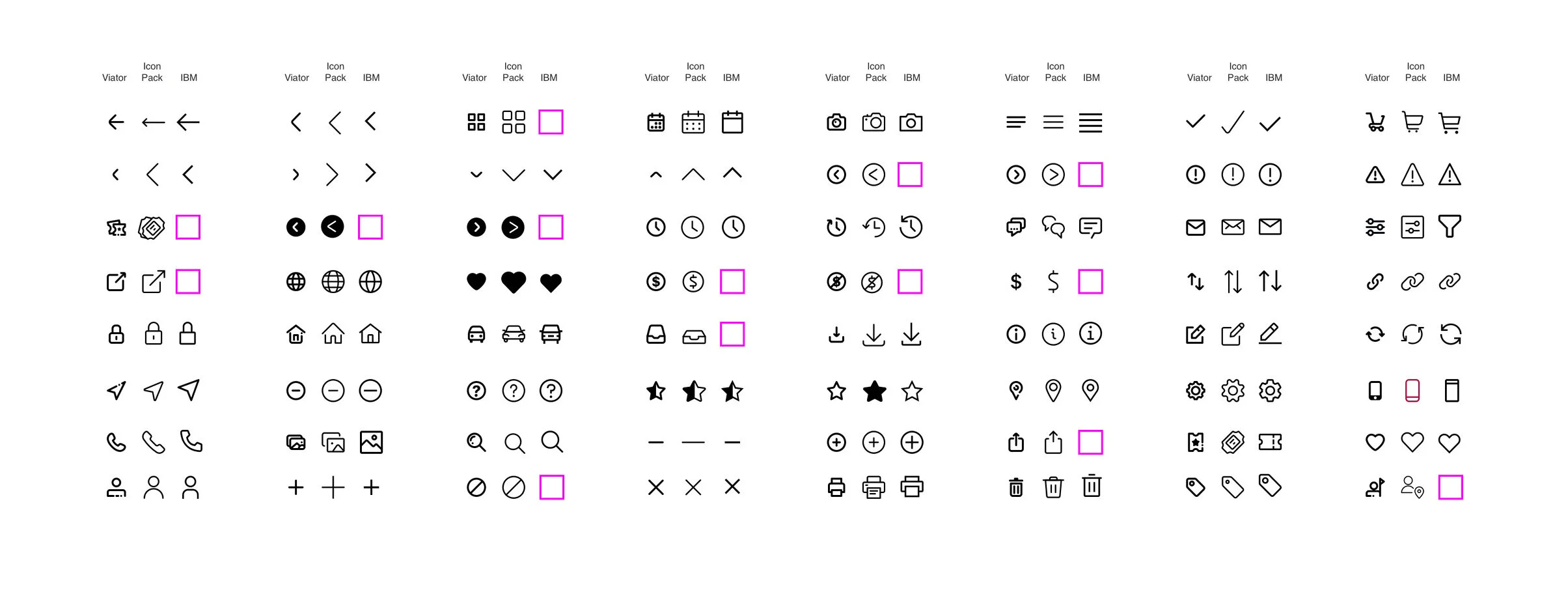
UI ICONOGRAPHY
In the final set of documentation, it was suggested that we use system icons from IBM. However, as I was building our DSM, I came to realize that they were not adequate for our needs. This led to a search for another icon system that would better suit the site.
TYPOGRAPHY
In the brand guidelines, the agency provided the typeface GT Haptik. Unfortunately, because of site load speed requirements as well as questions about the legibility of letterforms, we had to find a web-friendly typeface that felt similar. We landed on Google Fonts Poppins because the shapes felt familiar and there was a good level of variation on weights and glyphs.

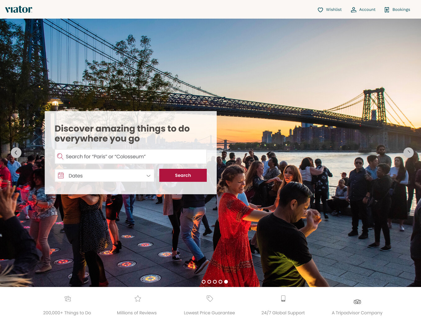
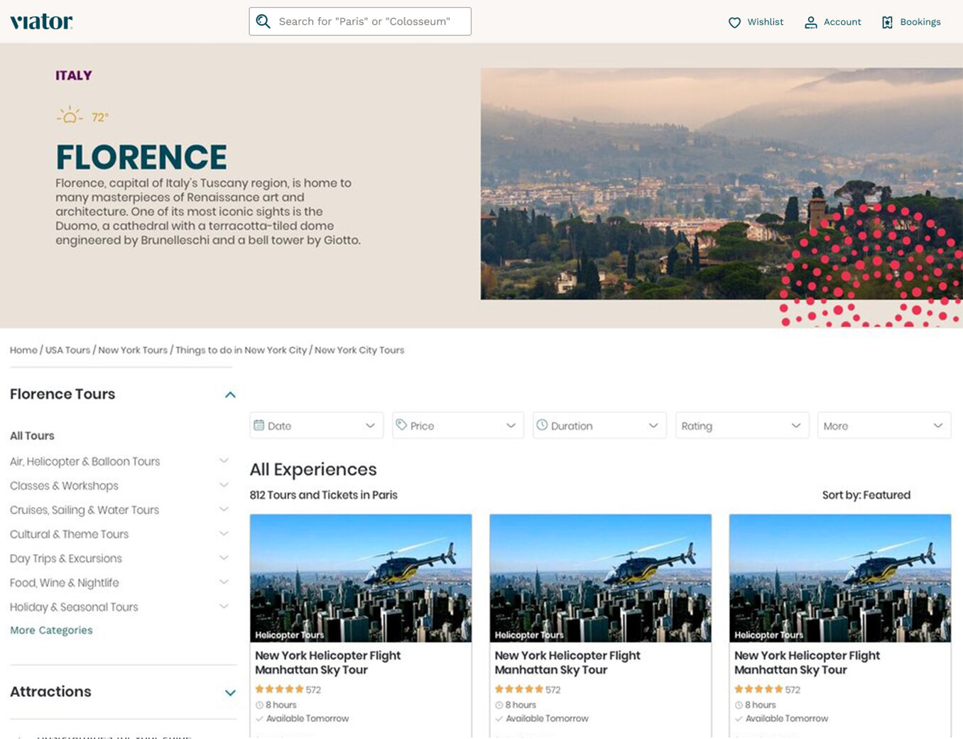
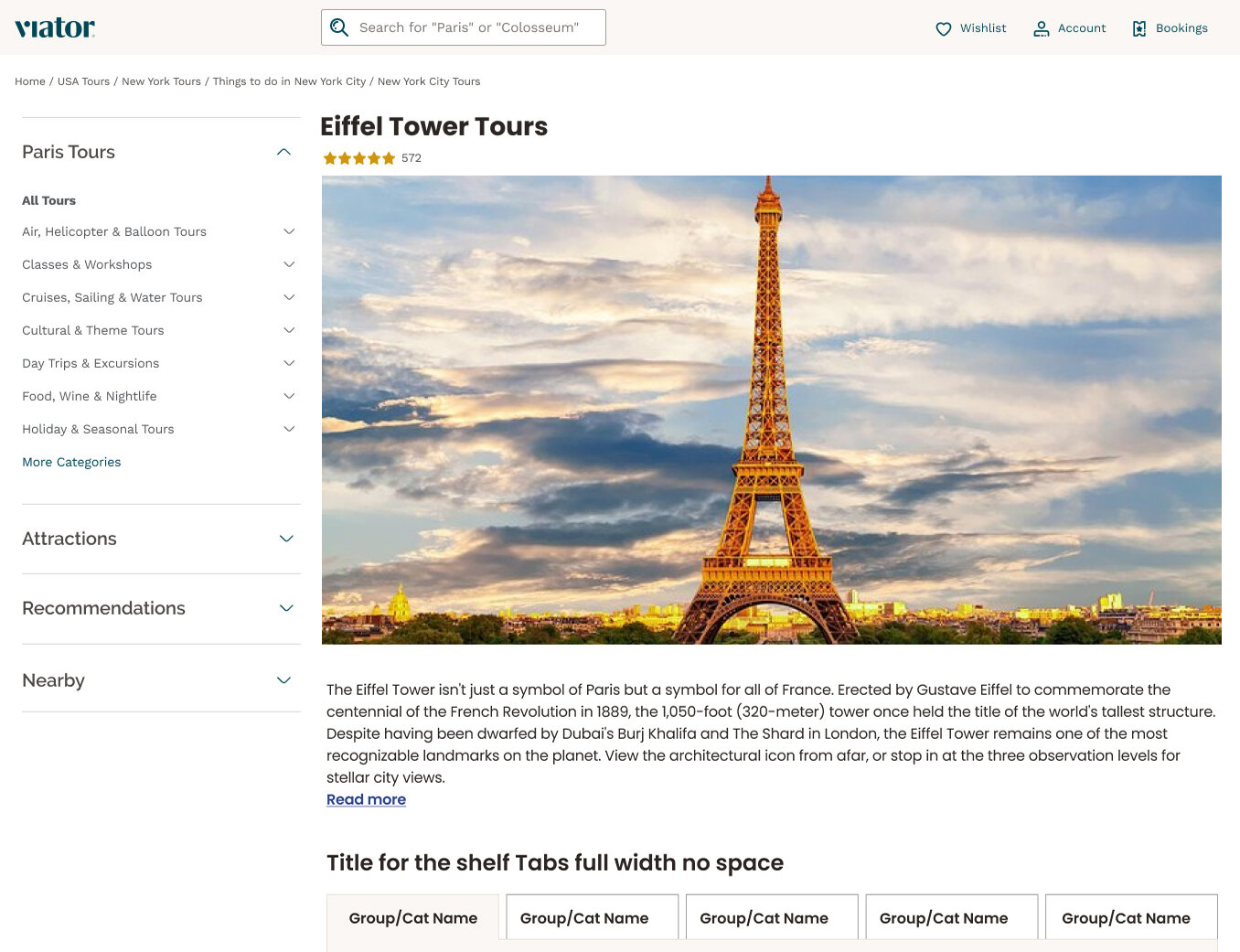
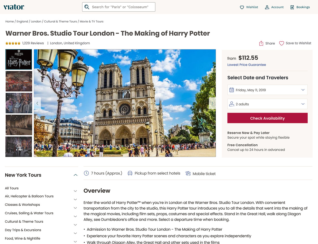
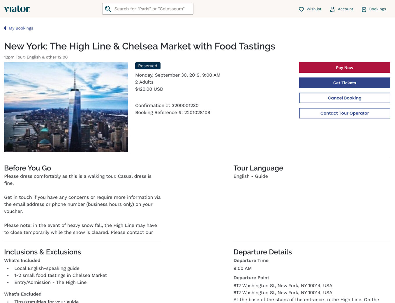
PAGE REDESIGNS
For Phase 1 of the rebrand, we were going to take all existing pages and apply the new color/type/iconography styling. Because of differences in type size, this meant some additional work was needed. Below are a few examples of the Phase 1 design approach.
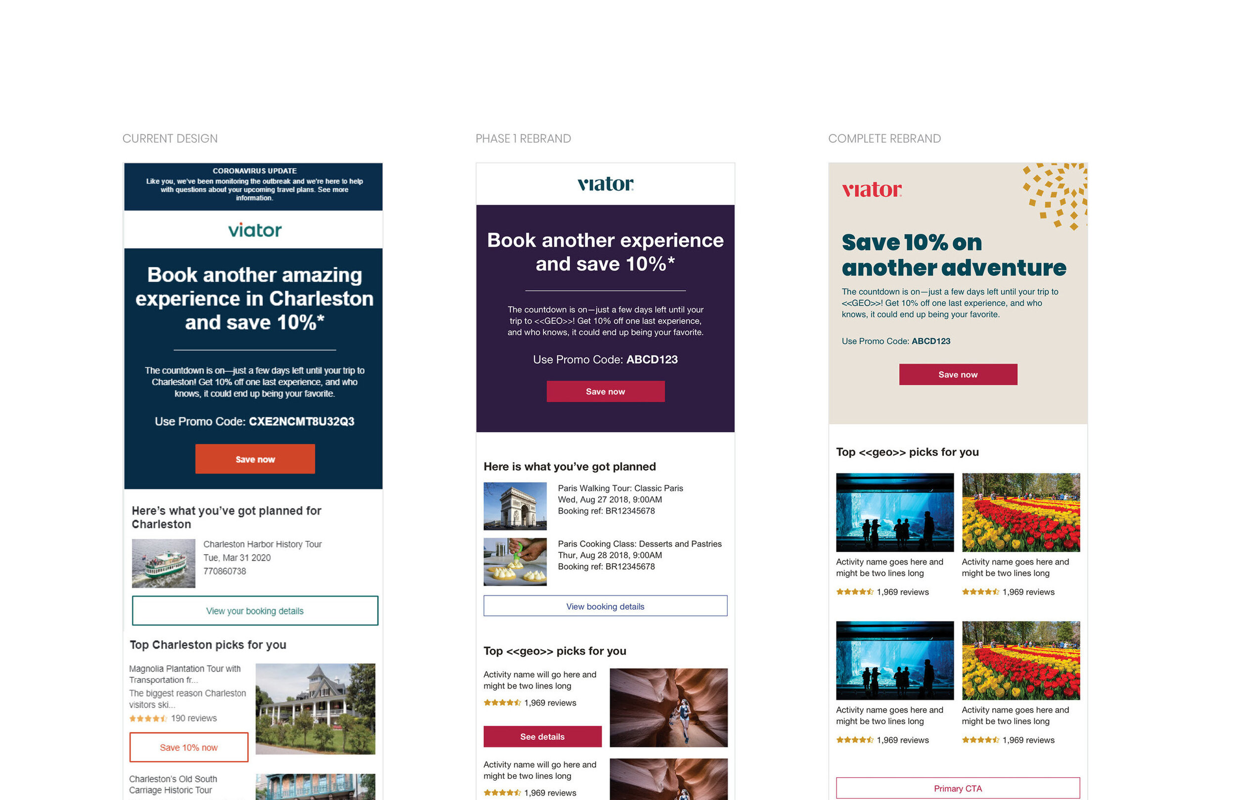
CRM CREATIVE REDESIGN
In addition to UI/Product elements of the rebrand, I also spent time working on how the brand CRM would compliment the new design updates. This involved taking numerous emails that were sent at different stages in the consumer journey and working through a multi-phase design update. Phase 1 of the brand update would be non-structural (i.e. using the same code and just updating the CSS values for each item). Phase 2 would involve completely overhauling all of the emails sent out, which was upwards of 70 individual templates that would need to be touched.